UI
This page contains the description of languages that add new cells to the editor. For more editor-related extensions, visit Editor Extensions | MPS Extensions ⧉.
AsyncCell
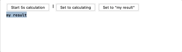
The async cell allows displaying a text-based loading indicator as long as the return string is null.
Create a new $custom cell$ editor cell and return a new AsyncCellProvider:
FrameCell
com.mbeddr.mpsutil.framecell
The frame ⧉ cell is a special editor cell collection that draws a top and bottom border around its contained cell. It supports the following style attributes:
- frame-color: the color of the frame (default: black)
- frame-width: the thickness of the frame (default: 1 pixel)
- frame-padding: the space between the containing cell and the frame (default: 3 pixels)
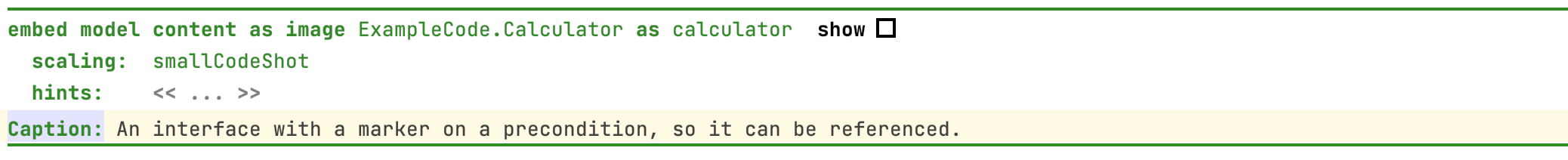
An example can be seen in the documentation language:
In most cases, you can use the language de.itemis.mps.editor.celllayout from MPS Extensions to customize the border and margins around a cell. The MPS Extensions documentation ⧉ contains more information.
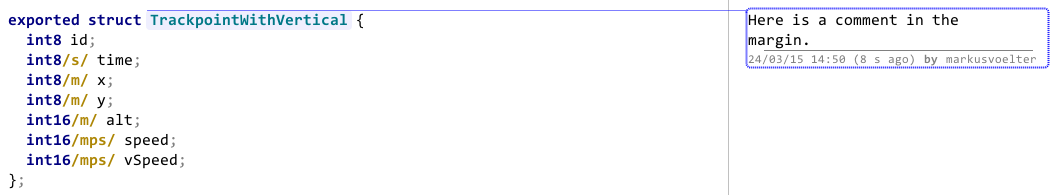
Margin Cell/Review
com.mbeddr.mpsutil.margincell and com.mbeddr.mpsutil.review
Margin cells are editor cells shown beyond the right editor margin, a bit like comments in Word. The ReviewNote cell implements exactly Word's comment facility as an example of the margin cell. Here is a screenshot:
Just include the respective language com.mbeddr.mpsutil.review to use the review notes. Intentions are available to attach review notes to editor cells.
Your cell must implement the IMarginCellContent interface to put your cells into the right margin. The editor of your cell may use the margincell-cell-width and margincell-dashed-line-interval style attributes to design the width and line style. The actual margin cell must be on the root element of the editor. However, as illustrated by the CommentAnnotationContainer from the review language, you can use an annotation to achieve this. Hence, you can add margin comments to every model without the model's language being aware.
Placeholder Text List
com.mbeddr.mpsutil.placeholderTextList
This language adds a new cell model ⧉ that supports multiple aggregations with a custom placeholder text.
Specify the placeholder in the inspector by creating a query function for the placeholder text.
Diagrams
Concept Diagram
com.mbeddr.mpsutil.conceptdiagram
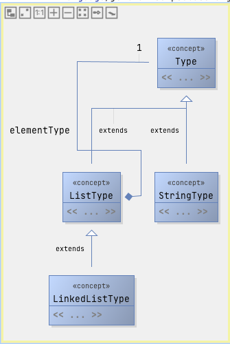
Create a new root node of the type ConceptDiagram ⧉. The editor should now contain an empty editor. You can drag nodes from the Diagram Palette to the diagram. If nodes from other languages are needed, add the language to the languages section.
The following options are available:
- auto populate dynamically creates the diagram on the fly for all listed languages or for the module itself if it is a language
- ignore deprecated concepts doesn't show deprecated concepts in the diagram
- auto layout on init runs the automatic layouting algorithm when you open the diagram and no layout data exist.
- don't save layout data disables the mechanism to save the layout data in the model. It can be combined with the previous option.
The following buttons can be pressed depending on the configuration:
- Populate fills the diagram based on the current provided/available information.
- Populate (ignore deprecated nodes) also fills the diagram but excludes deprecated concepts
- Clear removes the contents of the diagram
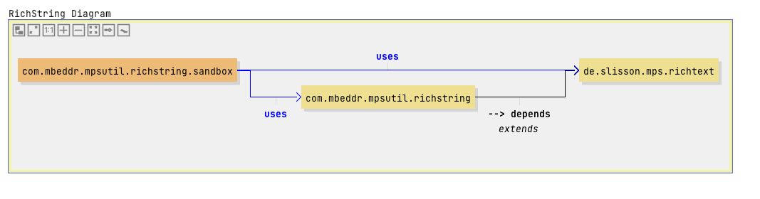
Dependencies Diagram
com.mbeddr.mpsutil.dependenciesdiagram
This language contains a concept DependenciesDiagram ⧉
Drag a model or module reference from the diagram palette to the diagram. Dependencies to other models/modules are automatically added. The line between the two boxes visualizes the dependencies, and its label has a name after the scope of the dependency (e.g., the label is uses if you have imported the language).
Date Picker
com.mbeddr.mpsutil.datepicker
A classic widget to select a date from a pop-up calendar.
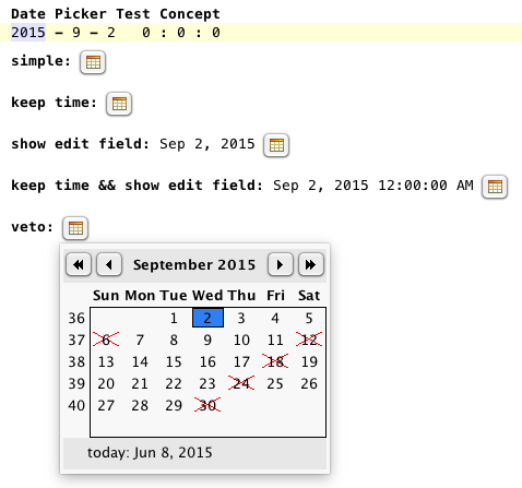
There's a known issue ⧉ on macOS. The date picker doesn't work when the theme is set to macOS light.
This widget is only the control. The developer handles synchronizing the control with the source of the shown date. We provide hooks executed before showing the calendar to determine whether a date is valid and process a selected date.
Editor Utils
com.mbeddr.mpsutil.editor.utils
The class EditorRuntimeUtil ⧉ contains a few helpful editor utility methods:
- getErrorText(EditorContext): returns the error text of the selected cell in the editor
- collectAllOpenEditors(Project): returns all opened MPS editors
- collectAllOpenEditorComponents(Project): returns all opened editor components
File Picker
com.mbeddr.mpsutil.filepicker
This language contains text-based files and folder pickers. Enter paths directly in
the editor. There's also an intention Open File Chooser Dialog that shows a file chooser dialog. The following file selectors are supported:
- file system dir picker ⧉
- file system file picker ⧉
- macro file picker ⧉
- macro folder picker ⧉
- solution relative dir picker ⧉
- solution relative file picker ⧉
The macro pickers can contain path variables ⧉.
All fill pickers can return paths relative to a IOutputLocationProvider, (non) canonical paths and valid paths or files. In addition, selected files/folders can be opened/edited with the system editor or opened with the system file explorer.
Hyperlink
com.mbeddr.mpsutil.hyperlink
Use hyperlink cells for references in MPS. In contrast to normal reference cells, they automatically become blue and underlined if the mouse hovers over them (no Ctrl is necessary). The following style attributes are supported:
- hyperlink-reference: Create a link for a node reference.
- hyperlink-handler is a function that's called when you click a link. The util parameter object contains a method openInBrowser for opening a URL with the default web browser.
- hyperlink-style: can be an URL or reference. The reference style forces the usage of the key ctrl to activate the hyperlink.
- hyperlink-node is the node that should be displayed after clicking the link
- hyperlink-focus sets the focus on the target node of the hyperlink after navigating to it.
- hyperlink-select selects the target node of the hyperlink after navigating to it.
JFreeChart
com.mbeddr.mpsutil.jfreechart
This module contains stubs for the JFreeChart ⧉ library. View the charts in the Chart tool by calling the following code:
createChart` returns an instance of JFreeChart ⧉.

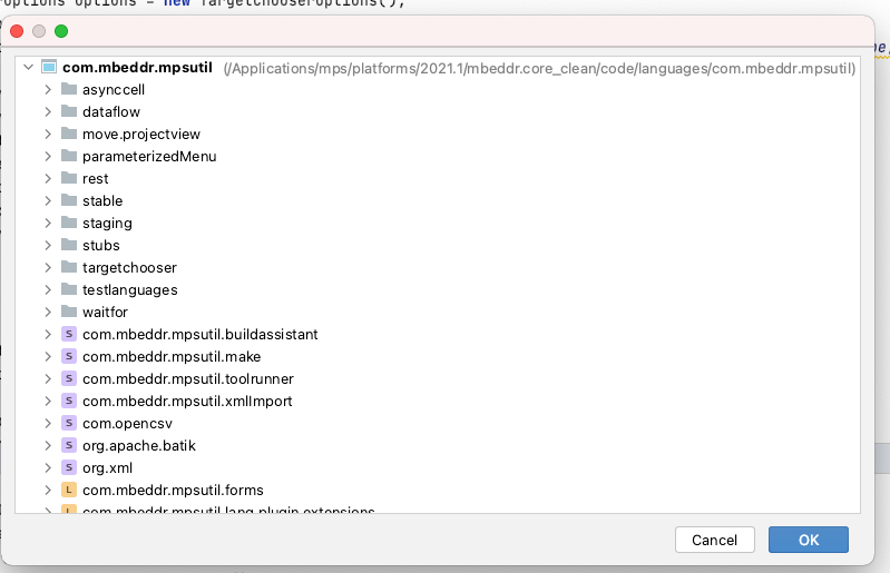
Target chooser
com.mbeddr.mpsutil.targetchooser
The target chooser language provides a modal dialog for choosing nodes based on a predefined scope:
Example code:
The options object has the following setters:
- setInitial sets the initially selected item. This object can be a node or a model.
- setSelectionValidator: A selection validator checks if the selected target is valid or shows an error message when it's invalid. By default, no validation occurs (the languages uses an empty validator).
- setSNodeFilter: This filter decides which nodes should be visible in the dialog (within the selected scope). To show a node, you must return true for the root node but not all ancestors.
- setModuleScope: This scope defines the available modules that will be the sources for the nodes that will be displayed.
- addModuleFilter adds a boolean filter for the modules of the module scope.
- showModulesPool sets a flag that decides if the modules pool (last entry in logical view) should also be visible in the dialog.
- setModelFilter sets a filter only to keep the models of the specified scope where the filter returns true
- setScope sets the scope for the items that should be visible in the dialog. This object can be an instance of TargetChooserScope ⧉ or a sequence of nodes (+ ancestor filter). By default, the specified modules scope with the specified model and node filers applied is used.
User Styles
com.mbeddr.mpsutil.userstyles
This language provides a new annotation @userConfigurable that can be added to a style class in a style sheet (intention: Make User Configurable). After defining a name, the user can change the style in the preferences (Preferences→Editor→Color Scheme→Code). The following style-class items are supported:
- Foreground: equivalent to text-foreground-color
- Background: equivalent to text-background-color
- Bold: equivalent to font-style: bold
- Italic: equivalent to font-style: italic
- Effects: Dotted lines, bold underscored, underscored, underwaved: equivalent to underlined
- Effects: strikeout: equivalent to strike-out
Further useful links for developers:
- Export IntelliJ editor themes as plugin | JetBrains blog ⧉
- UI Themes — Editor Schemes and Background Images | IntelliJ Platform Plugin SDK ⧉